Project Description
When airlines talk to us they understandably focus on our Electronic Techlog but Converge provides a lot more. So, we are running a few posts to provide insight to some capabilities that may be of interest but not quite as well publicised.
For quite some time we have worked with British Airways Cityflyer to provide analysis of their Operational Planning. They use Sabre for planning and each day a subset of the data is extracted and imported into a section of Converge for analysis. The different sections of analysis will be the subject of other posts, but this one focuses on the Operational Standby dashboard and is the result of working closely with the BACF team.
Ensuring that the correct crew standby coverage is available at crucial time periods at the different bases is not trivial. Without a simple way of assessing the coverage at a given point it time it is difficult to adapt the plan to changing events.
The Operational Standby Dashboard does that by providing users with all the information they need in an easy to use format. The goal was to provide the Operations team with indicators which would tell them at a glance what they need to know, and with minimal effort, the extra information that they might require.
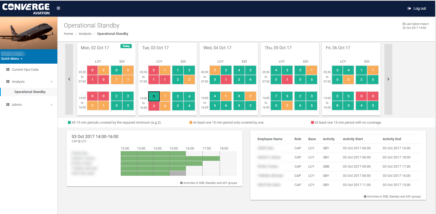
A page of the Operational Standby Dashboard is shown at the start of the post.
There are three main areas on the page:
- The day summary at the top (the screen shot shows a 5-day summary and the user can use the left and right arrows to navigate to other days).
- A Gannt chart representation of the scheduled standby duty periods of staff for the selected day, shift and rank – denoted by the “black box”.
- A table showing the details of the planned standby duty of staff for the selected day, shift and rank.
It is worth noting that the time of the last Sabre import is shown so the user is aware.
Day Summary
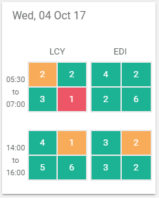
For BACF, the problem is concentrated on their two main hubs, London City and Edinburgh, and two crucial periods in the day, 05:30 to 07:00 and 14:00 to 16:00. So, the main element of the dashboard is the Day Summary. An example is shown above.
A day is represented by four groups of four squares. The four groups correspond to the two bases and two shifts in that day 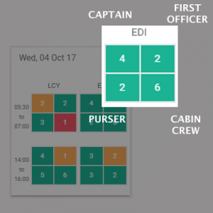 with LCY being the first column (the early shift at the top and the late shift at the bottom) and the second column representing EDI.
Each group of four squares represents the ranks of flight crew: Captain (CAP), First Officer (FO), Purser (PSR) and Main Cabin Crew (MC). The order that the ranks appear in is always the same and is highlighted in this graphic.
The squares show two things:
- Firstly, a count of staff that are rostered within the shift time period. This means at any point within the shift. So, for example, for the 05:30 to 07:00 shift, If someone is rostered to start at 06:30 they will be part of the count shown.
- Secondly, a colour which indicates the quality of coverage throughout the shift period. In this case based on an analysis of every 15 minute period within the shift:
- Red – if there is at least one 15 minute period without any coverage.
- Amber – if there is at least one 15 minute period with only one person providing cover.
- Green – if all the 15 minute periods in the shift are covered by the defined target threshold.
The combination means that the user is able to assess the standby coverage for several days at a glance. They are also able to navigate to the next days (there is no restriction) to look ahead.
Gantt Chart
Operational Standby Gantt
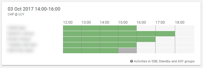
When the user clicks on a square on the day summary, the page displays the Gantt chart and table relevant to that square. Focusing on t he Gantt chart, the details are confirmed in the top left hand corner of the Gantt box, in this case: 3rd October 2017, the 14:00 to 16:00 shift for Captains based at London City.
The names of the captains are displayed in line with the duty schedule. Obviously for the purpose of this post the names have been blurred.
The Gantt itself is showing any relevant duty (i.e. standby duty) for the shift period with a 2 hour buffer at either side. This means that if will also show planned duty that is just outside of the shift focus which may help in re-planning quickly if required.
Table
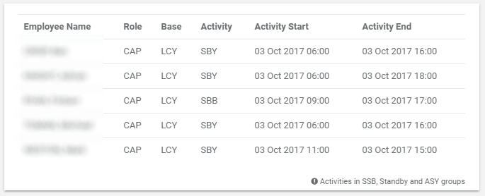
The same information is also displayed in table form which displays:
- The exact planned start and end times.
- The specific Activity code.
- Confirmation of the staff details (the “role” or “rank” will be displayed with an asterisk if the person has been “low ranked” for the schedule).
This is just one example of how Converge can provide ongoing benefits through data analysis.


